Background:
Sago Mini School is an app designed to teach preschool-aged kids about a wide-range of content and skills through play-based learning. Every month, a new topic is released (e.g., gardens, groceries, big trucks, etc.), each with a collection of topic-based games. For the Ponds topic, a target learning outcome was knowledge around the behavior of frogs. So, the design team made a jumping game to show kids the physics behind jump trajectories, while also building their fine motor skills and finger-eye coordination. This process involved many rounds of kid user testing and eventually landed on (pun intended) letter recognition, spelling, and vocabulary as the learning goals of the game.
Research questions:
- What is the best user-interface design to help kids accurately move their jumping character from platform to platform?
- How can a jumping mechanic be used to help kids practice letter recognition and spelling in a playful way?
Process:
The core driver of Jump and Spell is to jump from one platform to another. For the earliest design stage, the design team used a paper prototype, composed of paper, popsicle sticks, push pins, and a plastic toy.
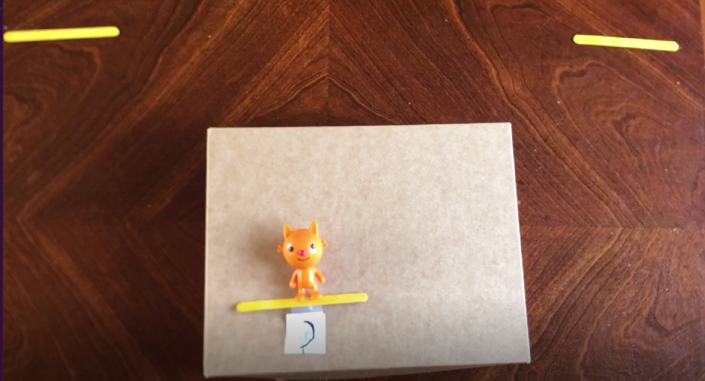
Before bringing ideas to kids, the team used this prototype to explore which visuals best demonstrated jumping or launching. The team made predictions of how kids might use the mechanics and tested out those predictions using our paper prototype. After internally testing and identifying reasonable designs that kids may respond best to, the team then programmed the digital prototype accordingly. For example, they made predictions about where children could place their fingers (e.g., on the platform vs. the character), whether the character should be on a stiff or rotating platform, and whether the platform should have a snap-back or spring-forward motion. Additionally, target learning goals were proposed, including physics, patterns, and early literacy.
Two kids (2-year-old and 6-year-old; one on each side of the target age range) remotely playtested the first digital version of the game based on their own time. Using a camera phone, a parent recorded the kid testers from over their shoulder.
Try and see
Kids had little prompting before play and their parents responded to any questions with “try and see what happens”. The team emailed instructions to parents before the play session to encourage them to not give their kids the answer and to respond to early struggles with questions. Therefore, kids had to rely on trial and error to figure things out, which gave them helpful insights on what made sense to kids and what didn’t in the initial designs.
Notice the nonverbal
After receiving the videos, the design team watched kids’ hand movements when they were and were not touching the screen. Noticing these non-verbal cues assisted with leveling decisions for platform placements and, later on, word choices. This data complemented the audio which helped identify patterns in kids’ narrations, frustrations, and celebrations. This combination of visual and verbal information shaped the team’s quick design-test iterations before expanding the participant pool.
Testing progressed to include a total of 10 kids (ages 3 to 6), using Playtest Cloud, an online platform for users to test mobile games. It does not show the playtesters, but instead records users’ screencasts and audio during each session. Noting what was said played a significant role in the team’s design choices that followed. If kids said “I don’t want to play this anymore”, then it was clear that the mechanics and/or goals of the game were missing the mark. When children started verbalizing target learning concepts, such as saying letters and target words out loud, then the team knew the game’s design was on the right track for supporting early literacy.
Pain points
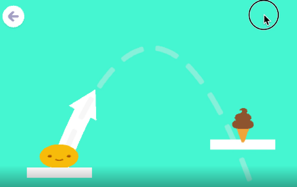
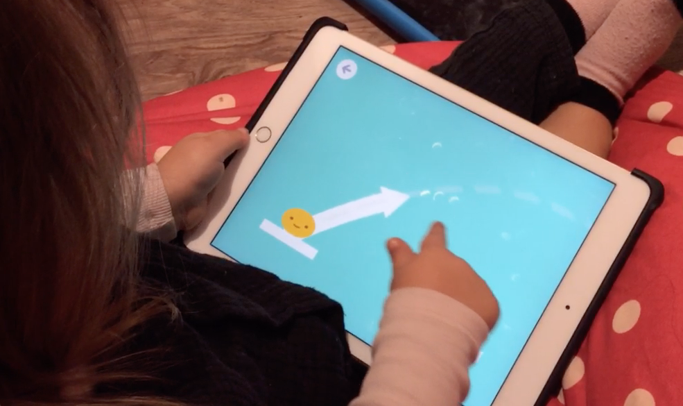
Additional pain points were captured and used to shape design decisions. For example, a dotted line was used for kids to see the predicted trajectory of an object before launch, and sometimes that line went off screen. Adults were then needed to guide when the tool did not. The team went through rapid iterations of the trajectory visuals (e.g., an arrow, solid line, dotted line, moving dotted line) based on those moments when kids needed adult help versus when kids completed parts independently.
Findings:
Jumping mechanism
- Rotating, spring-based, or pull-and-snap-back platforms may be accurate for teaching physics concepts, but they were too complex for preschoolers.
- Tablet screen dimensions limited the usefulness of the visual scaffolding designed to help kids predict where jumping characters will land. The visual cue used to show the height and distance a character will soar and land was frequently cut off by the screen’s size.
- Object placement (e.g., the team found that if platforms were too close together, then it limited kids’ ability to get to the correct platform) and objects’ “touch-box” sensitivities (e.g., tapping/dragging slightly to the side of the object) should be shaped by kids’ inaccuracies in hand-eye coordination.
Literacy
- Leveling an early literacy game can incorporate word-length and similar looking letters (e.g., d and b). Longer words required more persistence and letters similar in appearance could be used as “distractor” letters.
- If you make the game playful enough, kids will persist even when they get something wrong, instead of getting frustrated. This opens opportunities for introducing concepts that might be above kids’ developmental stage by scaffolding learning through play.
Impact:
Jumping mechanism
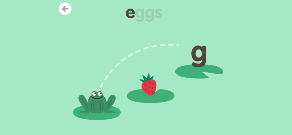
- When it came to user-interface, simplicity was best. Therefore, the team decided on stationary platforms and trajectory lines that are guided by a finger in front of the jumping character.
- Testing showed us that kids were less inclined to draw their finger backward to project the character forward, but instead drew a trajectory line with their finger to the target destination. So, the team designed the scaffolding lines to move with the placement of the finger and released the character once kids’ fingers lifted off the screen.
- The team learned the visual scaffolding was a critical piece for guiding kids to complete the game. Designers used dotted lines to show the trajectory a character would follow once “released”.
- Young kids’ fine motor skills are not precise, so the game was designed to be sensitive around hitting the target to decrease the difficulty significantly for jump accuracy. The platforms were also positioned closer together.
Literacy
- For leveling, after identifying which platforms were easier and harder for kids to navigate and confirming that certain letter distractors were not too hard, the team safety put them in later levels. To avoid making levels so hard that it could lead to frequent frustration, the team didn’t make every single jump a ‘hard’ distractor even within ‘hard’ levels.
- The final design prompted kids to leap to the correct letter needed to spell the target word displayed at the top of the screen. Multiple platforms were available to jump on, each with a correct letter, distractor letter, playful collectible, or nothing.
Play Jump and Spell by downloading the Sago Mini School app here!