Background:
Kahoot! Kids is a child-centered version of the Kahoot! learning platform, adapted to be more accessible and developmentally appropriate for kids age 3-7. The Kahoot! platform makes it easy for anyone to create, share, and host learning sessions that drive compelling engagement. Although data showed that both teachers and parents of young children were already using Kahoot!, it wasn’t an ideal experience for kids in this age group. So the Kahoot! Kids project set out to create an experience that met their needs while keeping the fun and challenge of original kahoots.
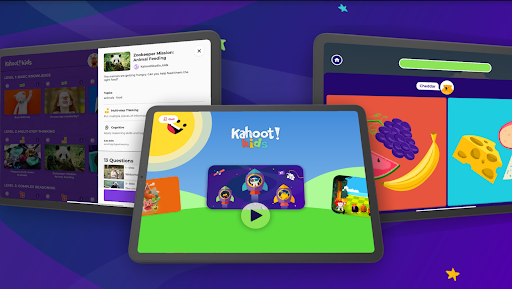
The Kahoot! Kids experience lives within the Kahoot! app, and consists of a wide array of curated kahoots—short visual quizzes made up of multiple choice and yes/no questions—on a variety of kid-friendly topics. The kahoots are mapped to four key early learning skills: literacy, numeracy, social emotional, and cognitive skills. The experience includes a narrator who reads the questions and answers aloud, and some basic game elements such as avatars and interstitial animations. The design principles for Kahoot! Kids were to spark curiosity in a range of fun and quirky topics and to foster connection among kids and families, both during and after playing with the app. The goal therefore was to design for these types of experiences in an age-appropriate way, within the parameters of an existing, more mature product.
Research question(s):
- Content: How do kids respond to different topics and quiz formats in the app?
- UI/UX: Can kids navigate all parts of the experience smoothly on their own?
- Concept: Does the overall experience of Kahoot! Kids make sense and appeal to kids?
Process:
Researchers hoped to gain insight into each of these areas, in order to make small changes before the release, and to inform larger changes and directions for continued development. Researchers conducted playtesting with 10 kids individually, meeting at their homes or in a public library with a parent present. Sessions lasted 20-40 minutes and consisted of 1) guided play time where kids played a preselected set of kahoots at a designated complexity level; 2) open play time where kids explored and chose any kahoots that interested them; and 3) closing reflection questions to understand the child’s overall impressions of Kahoot! Kids.
During both guided and open play time, researchers used a version of a think-aloud protocol, asking kids in the moment what they were looking for and why they made the choices they did. Researchers took notes on what kids explicitly said and did, as well as inferences based on that.
Why Variations
When researchers noticed that kids were struggling to answer a question correctly, they probed with questions like “Why did you choose that one?” or “Did you know the right answer there?” In many cases, this prompted kids to explain that they knew the correct answer based on what they had heard read aloud, but they didn’t know which written answer on the screen matched the audio.
See surprises
In contrast to the Kahoot! platform for classrooms, Kahoot! Kids was designed to not include a score, so players can attempt a question as many times as they need until they find the correct answer. However, researchers observed that kids did keep track in their minds of generally how well they did and how much they got wrong, and would have enjoyed a final result that could show their ability and even improvement for replayed kahoots.
Show and Tell
After the play session, researchers asked some overarching questions to get at the child’s general impressions of the app. One of the questions was: “How would you explain to a friend what this app is like?” Responses to these questions painted a picture of what kids expected and what they experienced, as well as how that compares to other apps they use.
Findings
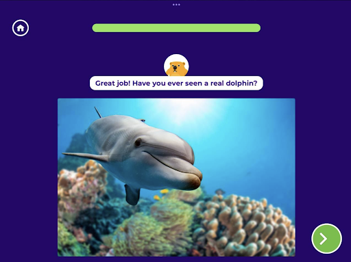
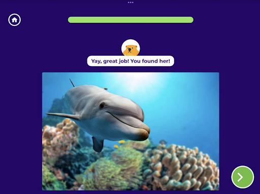
Content: Researchers were surprised to find that kids were happy to play even very simple kahoots that might have been seen as too “young” for them, as long as they were interested in the topic. Certain practices in writing kahoots were confirmed as successful, while other practices did not come through in this format. For example, kids were confused by kahoots that ended in open-ended thought questions (e.g., “Which sea animals have you seen before?”), since they expected to see answer options in the app like they had for previous questions. Researchers also observed that factual questions (e.g., “Which one is a starfish?”) led kids to guess when they didn’t know the answer, which didn’t engage them in the deep thinking and inference-making that the team had hoped to see.


- UI/UX: Overall, kids could navigate the app on their own as it felt familiar to other content pages they use in other apps. However, in addition to kids’ desire to track their score, various specific UI issues were uncovered, such as visual cues that were too subtle for kids to notice, and the habit of scrolling vertically but never horizontally. Many kids were also confused about how to interact with the carousel of character icons; a tap on the carousel rotated it, but kids expected it to open that character’s page, saying things like “Oh, it must be broken, it didn’t go to Elsa.”
- Concept: Although the app appealed to all kids in the study, researchers noted major differences in what children of different ages were able to get out of it. Older kids took to the quiz format right away, but their main impression was seeing Kahoot! Kids as primarily a guessing game, which may not be engaging enough to hold their interest over time. Younger kids were able to use the app but often lost interest partway through a kahoot, likely because of a lack of more tactile, age-appropriate interactions. The conclusion from these observations is that Kahoot! Kids v1 is a good foundation but needs more variety of interactions to really meet the goals of engaging a wide age range of kids with curiosity and connection. This finding will directly inform the next iteration of the designs.
Impact:
- Quick fixes: Kahoots written with open-ended question prompts at the ends were replaced with a line of encouragement or fun fact (e.g., “Dolphin babies like to play games just like you do!”). The team also minimized the factual questions and added more multi-step thinking questions, in order to encourage more complex reasoning (e.g., a question that shows a kid making a yucky face and asks whether they are smelling cake or garbage). UI issues that were barriers to use and had clear solutions were also addressed right away.
- Post-launch punch list: The team agreed that more involved findings which weren’t showstoppers could be addressed once the dust from the launch settled. This included adding more visual cues to let kids know which answer was currently being read out, and adding more content around topics kids requested, such as emergency vehicles.
- Future directions: Bigger picture findings that would require new features or a different approach to make improvements in a meaningful way were saved for the next phase of ideation and development. For example, in future versions the team may add question types that are more aligned to the cognitive and motor abilities of 3 year olds, which might increase engagement and learning in that age group.
To learn more about Kahoot! Kids, visit kahoot.com/kids.
